- Published on
Tailwind: a love story
- Author
- William Wittenbrock
I'll be straight with you from the start: this is a biased review. I'm a fanboy of Tailwind's creators, Steve Schoger and Adam Wathan. I first became familiar with them when they released their book Refactoring UI, which ended up heavily influencing my UX/UI design methodologies. I recommend reading it, particularly if you self-identify as a developer "who hates making UI."
In general, CSS frameworks are primarily trying to solve two problems: offer a standardized way to write CSS and decrease the amount of time spent writing it. Having a team of ten developers who are all composing their own styles is a recipe for disaster. Individually written CSS doesn't scale – specificity conflicts become a nightmare. A developer's inline comments are never as good as a framework's documentation. Teams need a system in place like object-oriented CSS, linting, or a framework that can help guide and manage their CSS.
Before Tailwind, I was never a big fan of CSS frameworks. Frameworks like Bootstrap and Bulma sound great on paper. But in reality, I've spent the same amount of time overwriting framework classes as I have spent utilizing them. We've all been there - deconstructing Bootstrap classes to figure out why a hero component has a padding of 2rem instead of one.
I've been using Tailwind in production environments for three months now, and here's what I love about it.
What you see is what you get
Here's a quick question: just by looking at the markup, which of these buttons do you know more about?
<!-- Bootstrap -->
<button type="button" class="btn btn-primary btn-lg">Button text</button>

<!-- Tailwind -->
<div class="flex rounded-md shadow-sm">
  <button
    type="button"
    class="inline-flex items-center px-3 py-2 border border-transparent text-sm leading-4 font-medium rounded-md text-white bg-indigo-600 hover:bg-indigo-500 focus:outline-none focus:border-indigo-700 focus:ring focus:ring-indigo active:bg-indigo-700 transition ease-in-out duration-150"
  >
    Button text
  </button>
</div>
In the first example, you can infer that it's a primary button. But what color is a primary button? We also know that the button is large, but how large? Finally, what styles are attached to the btn class?
Now, this is a pretty simple and silly example because, in a lot of ways, abstract CSS classes are useful, especially when making common UI like buttons. What I'm trying to point out here is that with abstraction, you lose information. To answer the questions I listed earlier, you'll have to open up a browser's inspector and deconstruct each class or find where the classes are being declared in the framework's stylesheets. This can be a lot of work if you run into a situation where the CSS classes are working against you.
Now let's take a look at the Tailwind button. Right off the bat, you'll notice that the markup feels crowded. This is probably Tailwind's most cited critique; developers from abstract heavy frameworks immediately see their markup becoming saturated with CSS. Crowded markup is unavoidable if you use atomic CSS; it's just what's going to happen.
But here's what you get in return – complete readability. By reading the CSS classes on the Tailwind button, we know that it has rounded corners rounded-md and a small drop shadow shadow-sm. Additionally, we know that it's indigo bg-indigo-600, its font color text-white, a relative idea of how big it is px-2.5 py-1.5, and its hover, focus, and active states.
Remember how I keep complaining about fighting and overwriting CSS classes from other frameworks? Changing this button's styles is a two-second affair, thanks to Tailwind.
<!-- Tailwind -->
<div class="shadow-md...">
  <button type="button" class="bg-blue-600 text-md...">Button text</button>
</div>
Here I've increased the intensity of the drop shadow shadow-md, changed the button's background color to blue bg-blue-600, and made the font size larger text-md.
I've also found that markup written with Tailwind scales well as a team grows. When I hand off components written with Tailwind, other developers know precisely how the markup and CSS work together. They don't have to search my CSS files to figure out what styles are in the class photo__caption. Furthermore, they don't have to worry about what will happen if they remove the class entirely or if the cascade will break if they add another <div> to the markup.
With Tailwind, you'll spend less time file hunting and debugging. Even better - you won't have to spend any time deliberating on how to name your CSS classes.
Easy peasy media queries
Tailwind makes writing media queries easy. One of my first 'whoa, this is cool' moments with Tailwind was when I was making a component responsive. Out of the box, Tailwind comes with these breakpoints:
- sm (min-width: 640px)
- md (min-width: 768px)
- lg (min-width: 1024px)
- xl (min-width: 1280px)
Let's say I've got a button, and I want it to get bigger as the viewport gets wider. Adding padding to the button with the above prefixes is simple:
<button type="button" class="px-3 py-2 md:px-4 lg:px-6 lg:py-3">
  Button text
</button>
For comparison, if I wanted this same functionality in SCSS, this is what I'd have to write:
.button {
  padding: 0.5rem 0.75rem;

  @media screen and (min-width: 768px) {
    padding: 0.5rem 1rem;
  }

  @media screen and (min-width: 1024px) {
    padding: 0.75rem 1.5rem;
  }
}
Tailwind alleviates the tedium of composing media queries. I've actually found the process of making components fully responsive, enjoyable, something I thought I'd never say.
A design system that reduces work
One of the struggles of designing great UI is getting the small details dialed in. I often have two pain points when building UI: determining an element's size and how it uses color.
In the past, before Tailwind and Refactoring UI, I would spend twenty to thirty minutes agonizing over the sizes of my h1 – h6, changing the size of each heading pixel-by-pixel. I can't tell you how many times I've given an element like a dropdown menu 20px of padding. Then, five-minutes later, gone back and continued re-adjusting its padding. Getting little details like these can be both challenging and exhausting.

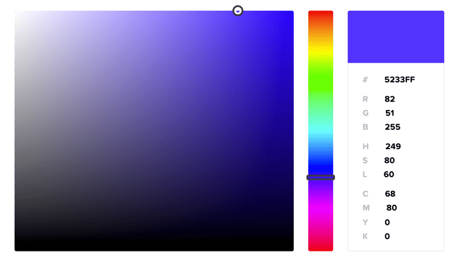
Part of the problem with determining an element's size and its color is the infinite number of options to choose from. If you open up a color generator, it's easy to feel overwhelmed; thousands of colors are available. This overwhelmed feeling is called the Paradox of Choice. Ironically, having an abundance of options actually leads to paralysis, rather than a decision.
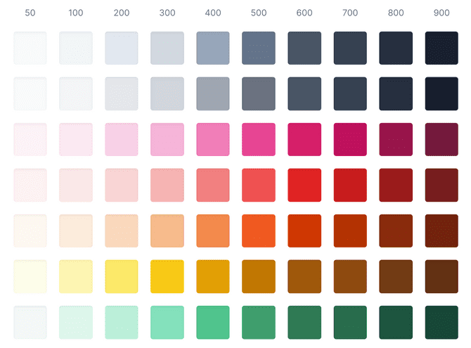
This is where Tailwind shines. All of Tailwind's utility classes are built on pre-defined scales (this can be customized). These scales, which inherently limit your choices, are one reason why I've found building UI with Tailwind so enjoyable. Is my modal's heading too small? Ok, let me bump its font size up from text-base to text-lg. Does the navigation bar feel too dark? Let's try making the background color brighter by going from bg-gray-800 to bg-gray-700.

This is the power of a design system. It decreases development time by reducing the number of decisions you have to make. But, it also creates sharp, buttery UI. Before starting a project, it's essential to formulate a palette with colors that all work together. Once you begin building elements, you'll find this initial investment pays off - all your elements look good because the colors you made them with look good. Similarly, a pre-defined size scale creates a proportional UI because its components are built around the same ratios.
I get anxious when I look at some of my old designs. All the components are composed of various sizes. The buttons have a padding of 17px. The column gaps on the image grid are 25px. The margin-bottom on my paragraphs is 14px. It's so clear to me how much time I spent tweaking these elements until they were just right.
The hype is real
Tailwind has been getting a lot of hype in the frontend community lately. Some developers are even saying it's the Bootstrap killer. I don't think that will happen. Not because I believe Tailwind will end up becoming a fading trend, but because Bootstrap and Tailwind occupy different niches - they're not competing against each other. Bootstrap is an abstraction framework. Tailwind is a utility framework.
I'm excited to see how Tailwind develops over the next few years. I think there's a good chance it will influence how developers design their CSS. Next time you're spinning up a practice project, give Tailwind a try. See for yourself what all the hype is about. Maybe you'll find yourself raving about it in a blog post three months from now, too.
